ROLE : CO-FOUNDER & DESIGNER
SEPTEMBER 2022
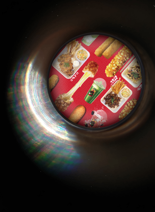
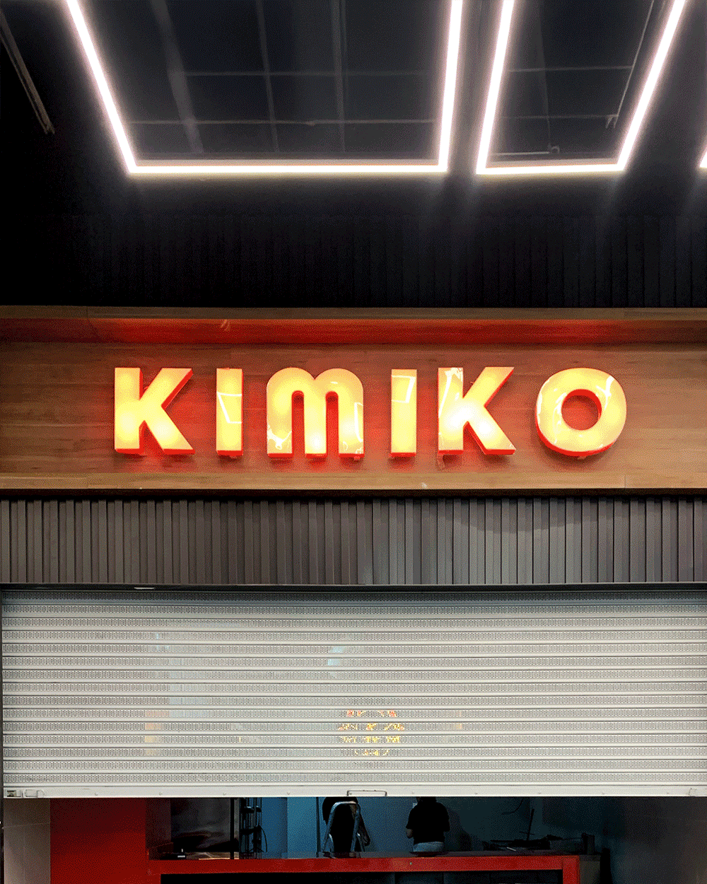
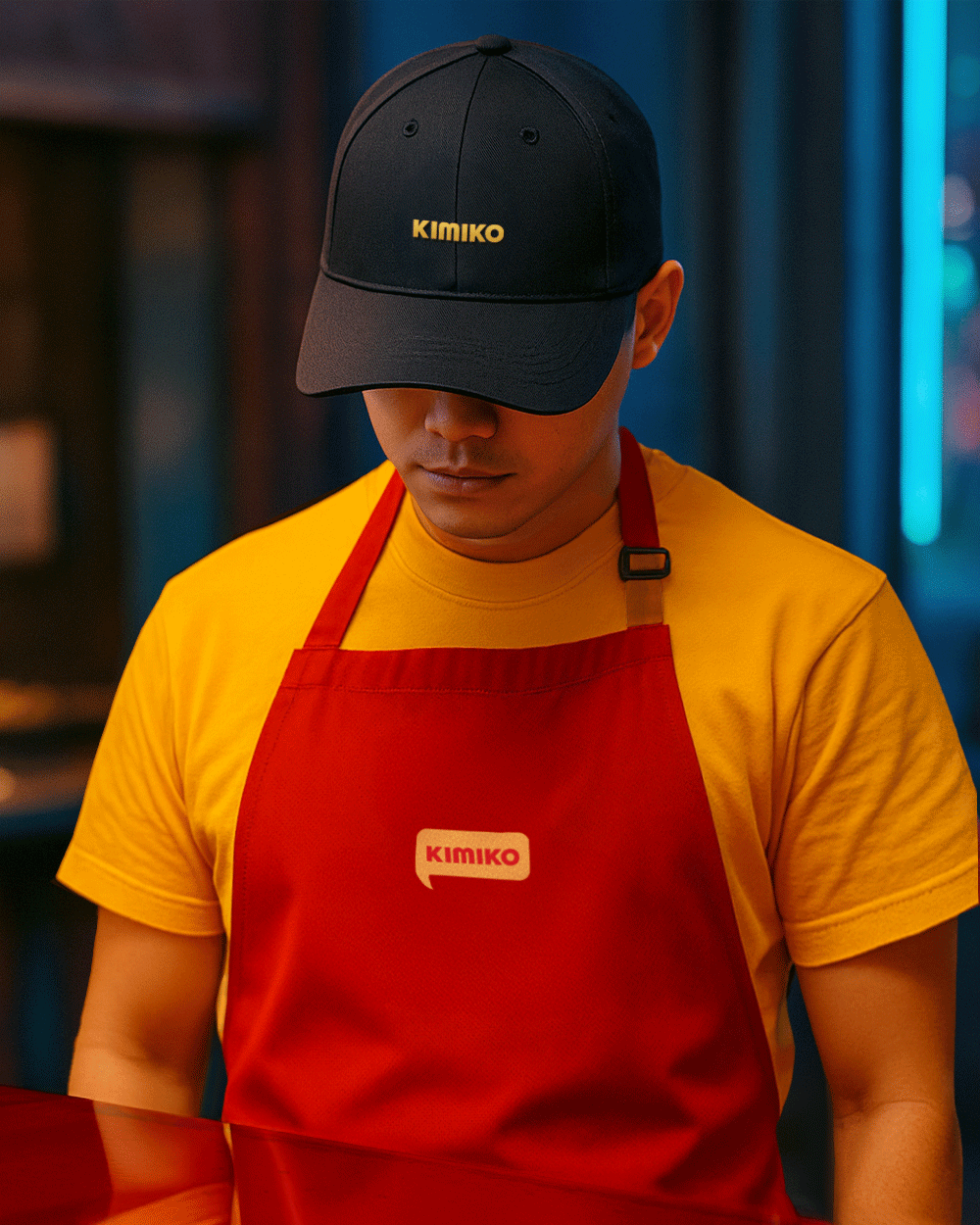
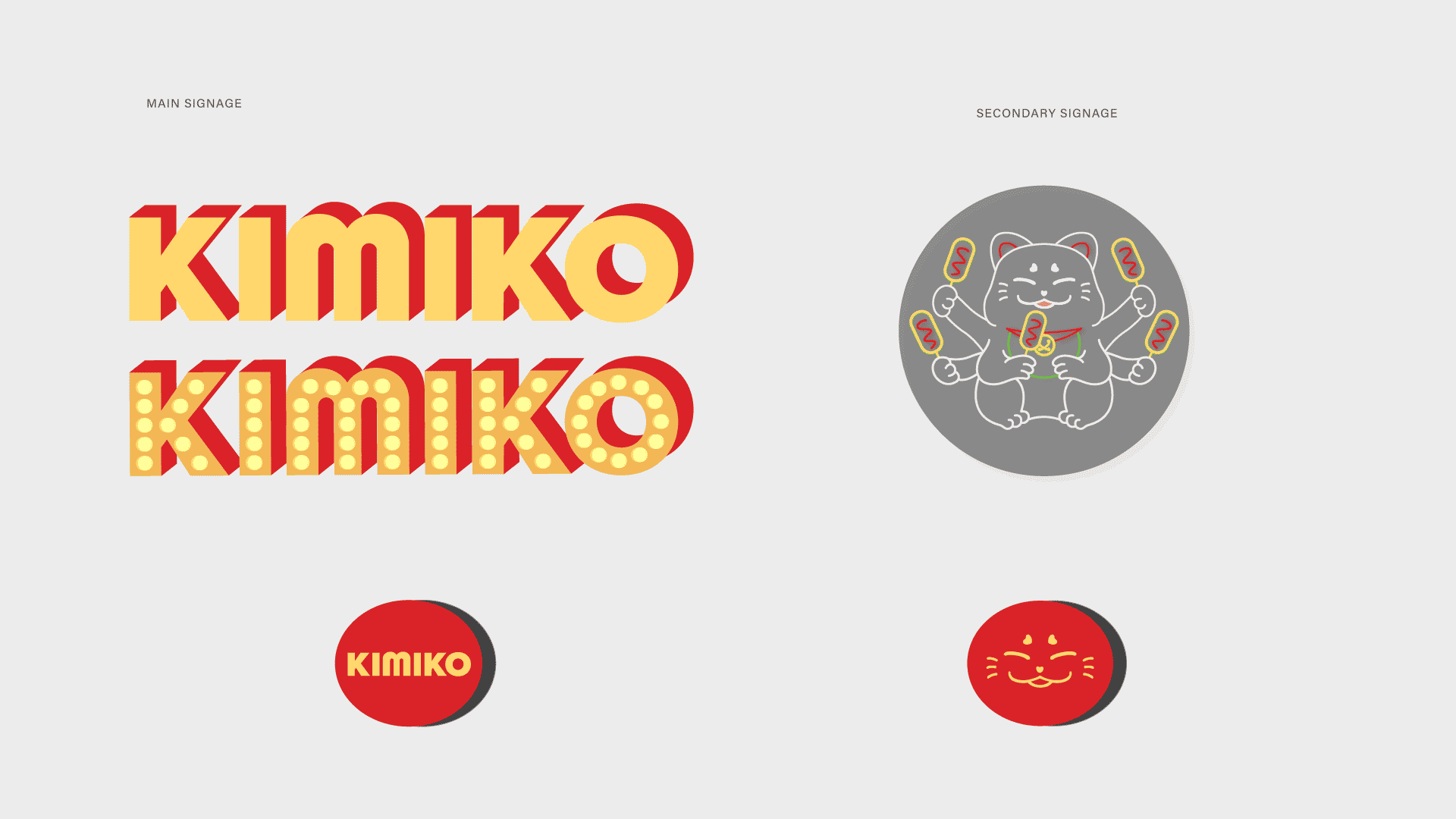
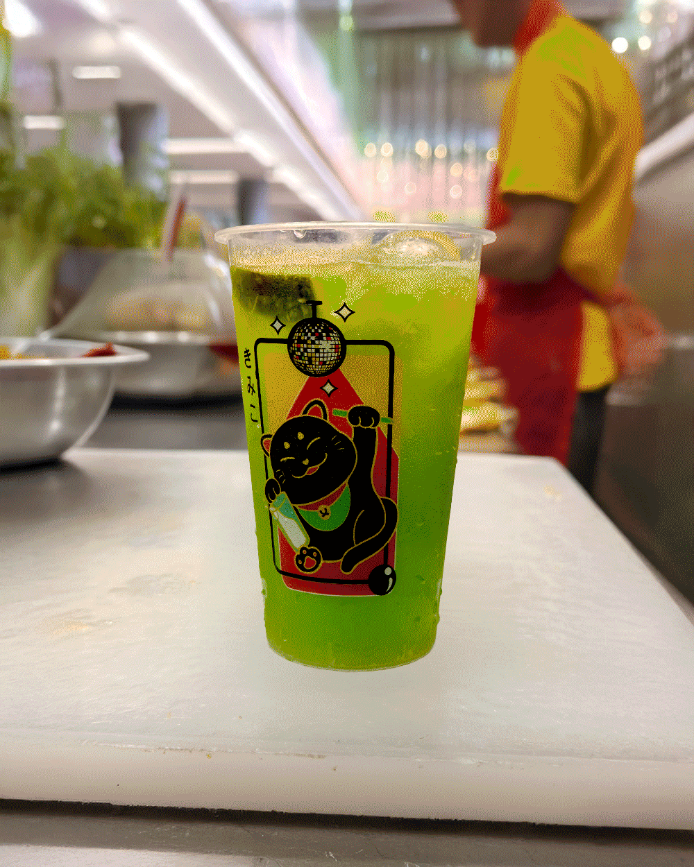
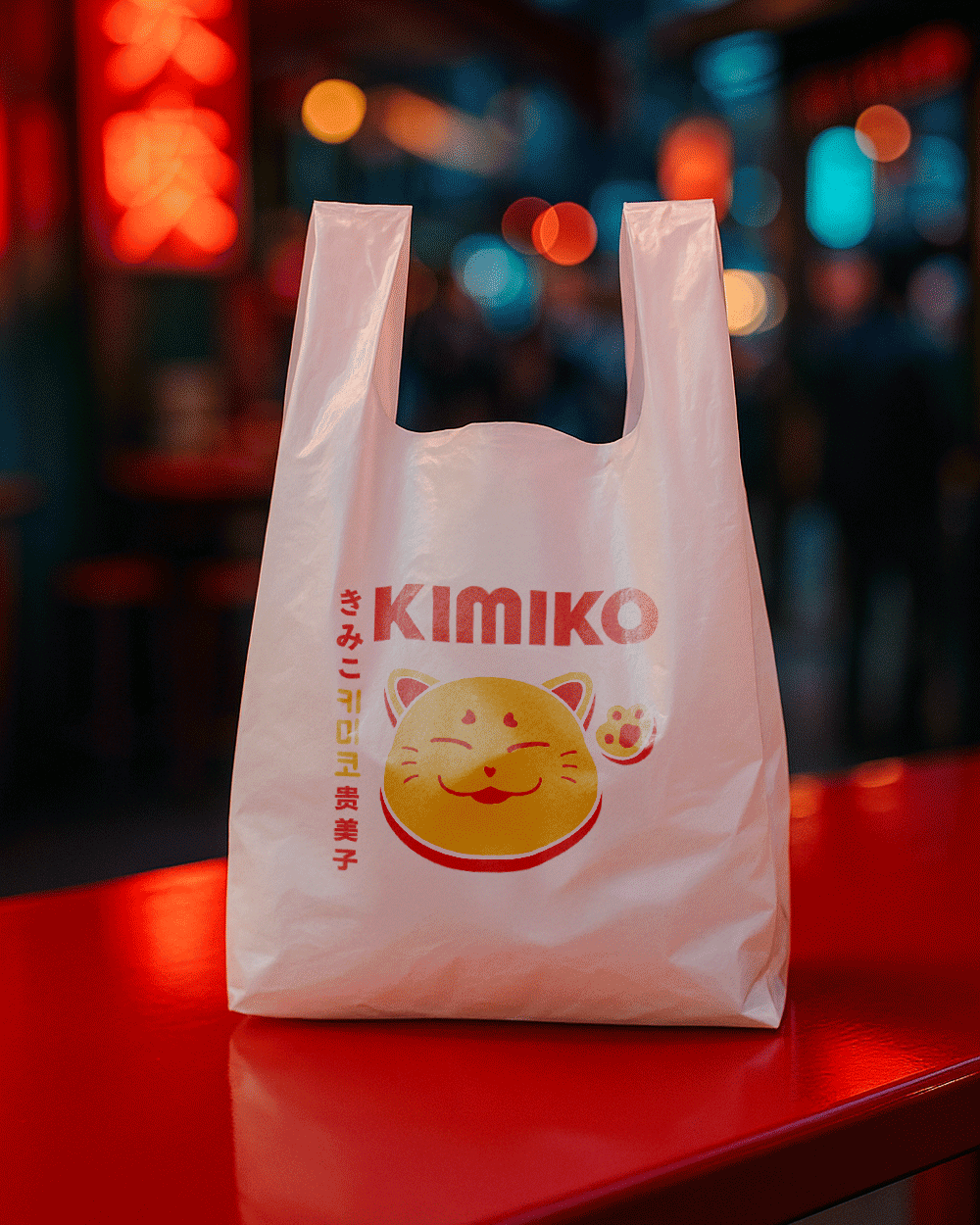
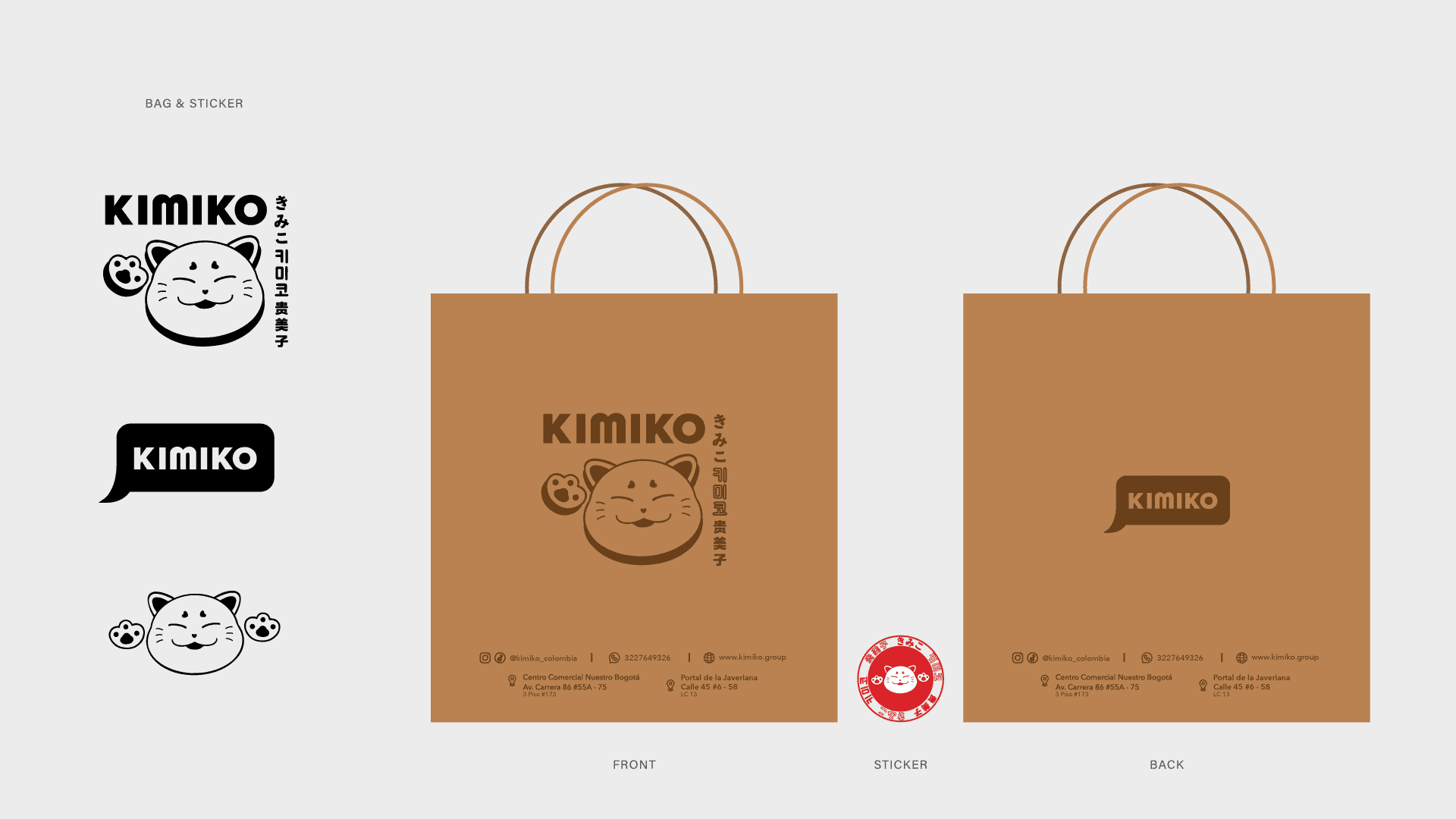
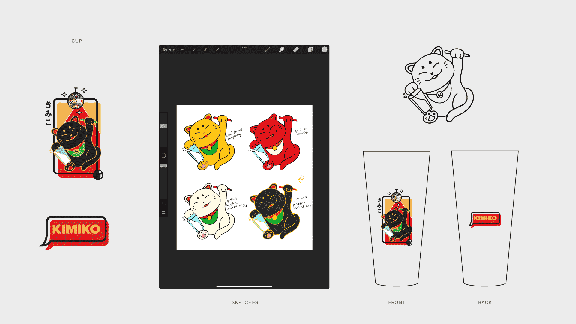
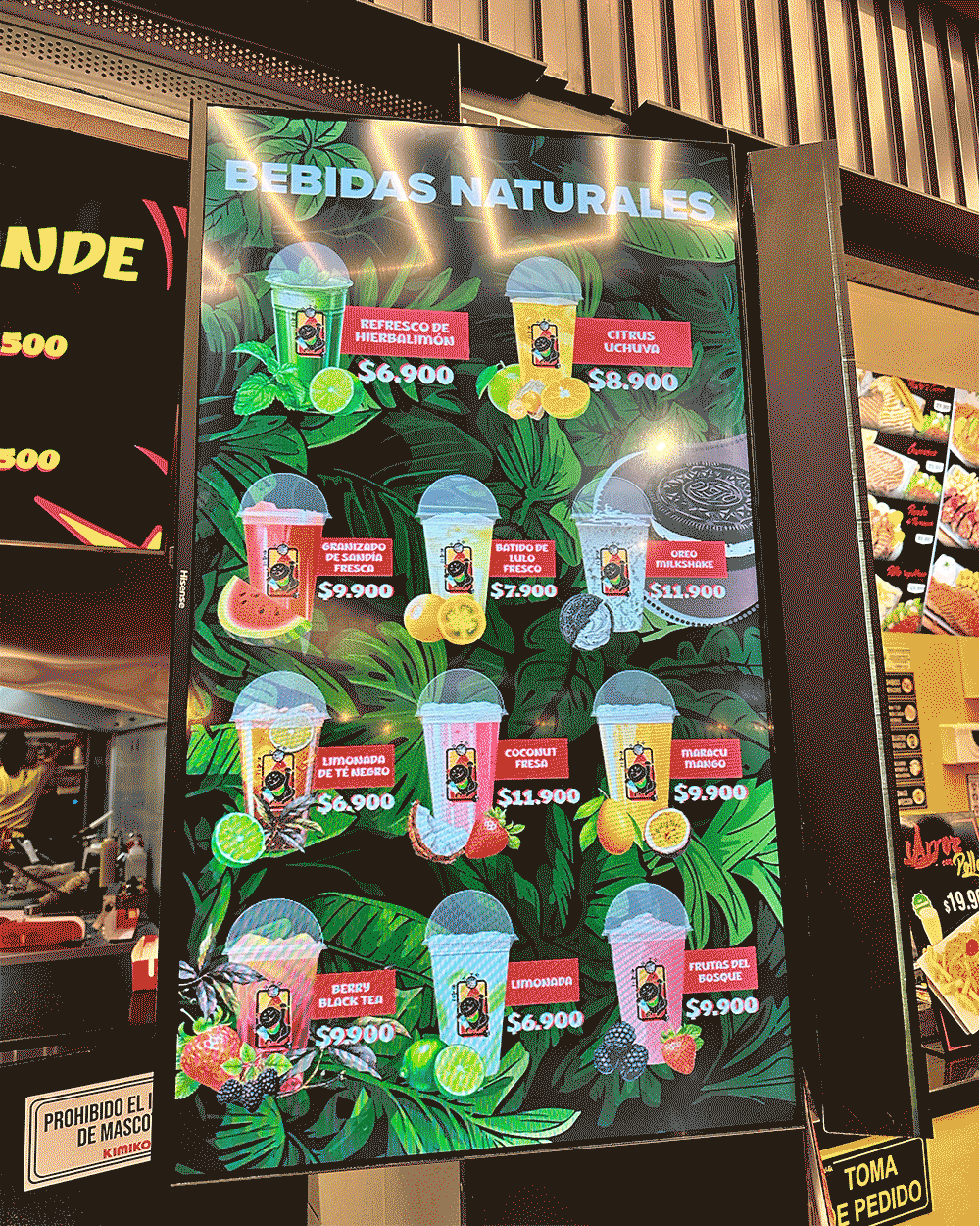
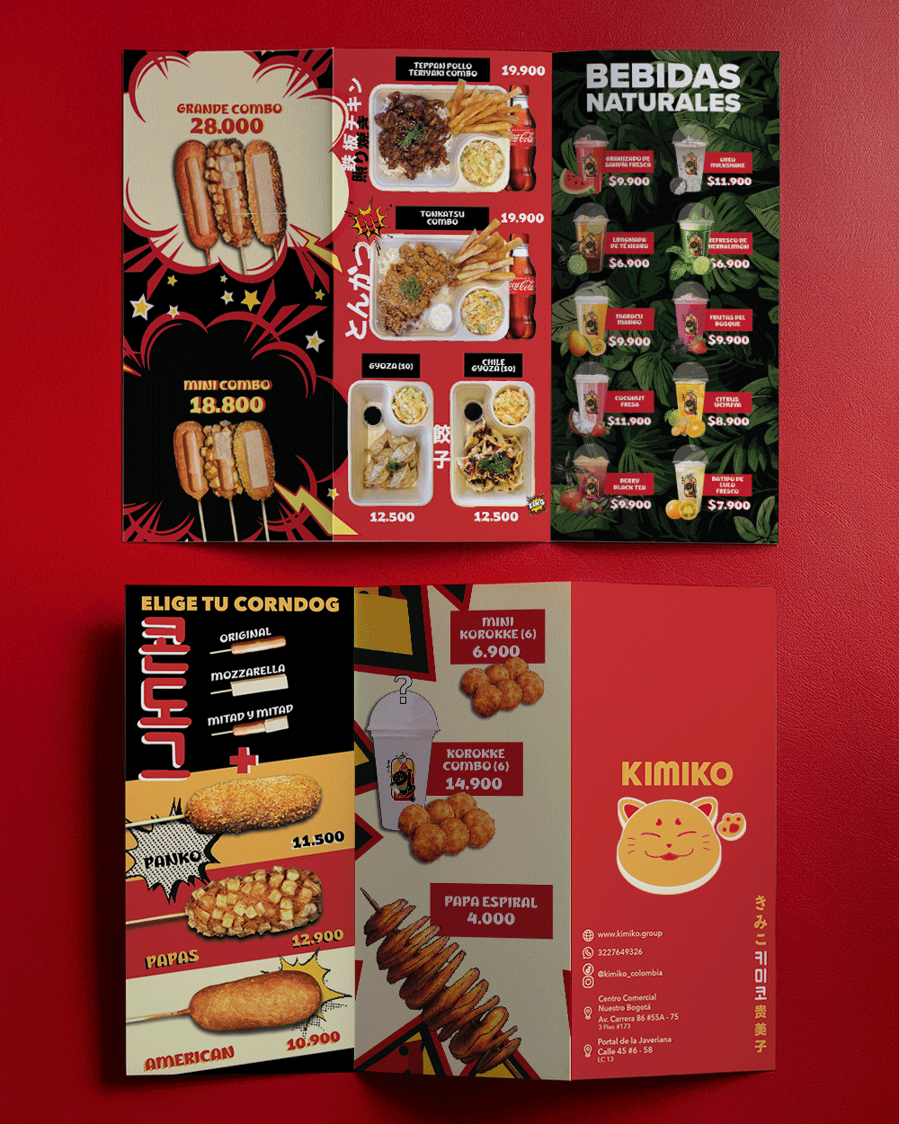
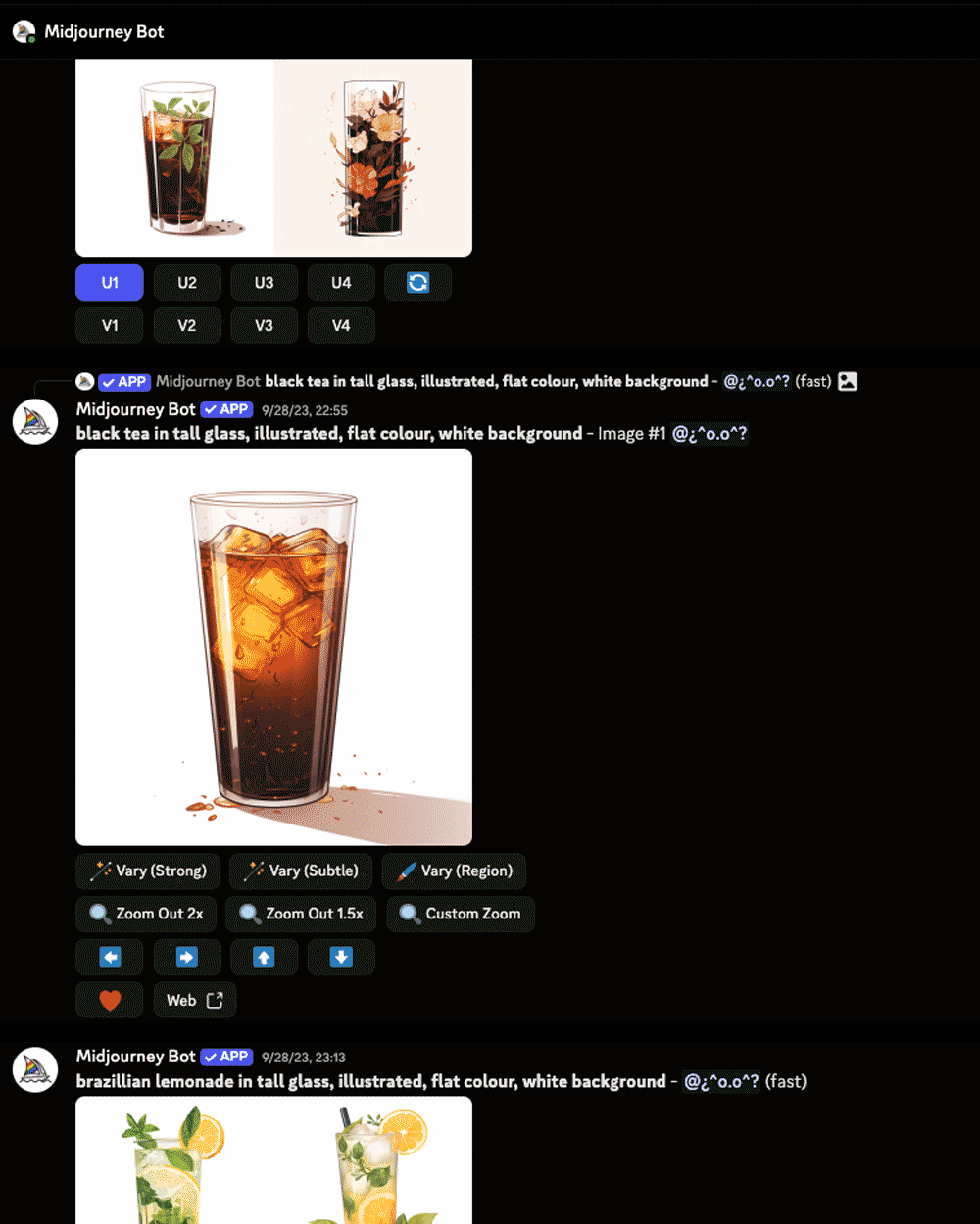
KIMIKO MARKETING
[ TOOLS ]
ILLUSTRATOR, PHOTOSHOP, MIDJOURNEY, INDESIGN
[ CATEGORY ]
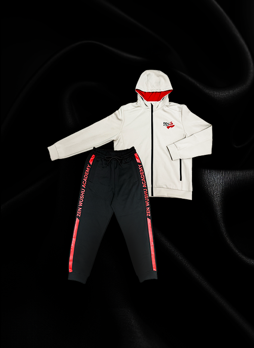
BRANDING, PACKAGING, APPAREL
[ DELIVERABLES ]
LOGO & COLOR PALETTE, SIGNAGE, UNIFORMS, PAPER BAG, PLASTIC BAG, CUPS, MENUS